
 免费AI编程助手

stateStyles:多态样式
2024-01-25 12:02 更新

@Styles和@Extend仅仅应用于静态页面的样式复用,stateStyles可以依据组件的内部状态的不同,快速设置不同样式。这就是我们本章要介绍的内容stateStyles(又称为:多态样式)。
概述
stateStyles是属性方法,可以根据UI内部状态来设置样式,类似于css伪类,但语法不同。ArkUI提供以下四种状态:
- focused:获焦态。
- normal:正常态。
- pressed:按压态。
- disabled:不可用态。
基础场景
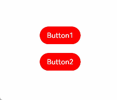
下面的示例展示了stateStyles最基本的使用场景。Button1处于第一个组件,Button2处于第二个组件。按压时显示为pressed态指定的黑色。使用Tab键走焦,先是Button1获焦并显示为focus态指定的粉色。当Button2获焦的时候,Button2显示为focus态指定的粉色,Button1失焦显示normal态指定的红色。
- @Entry
- @Component
- struct StateStylesSample {
- build() {
- Column() {
- Button('Button1')
- .stateStyles({
- focused: {
- .backgroundColor(Color.Pink)
- },
- pressed: {
- .backgroundColor(Color.Black)
- },
- normal: {
- .backgroundColor(Color.Red)
- }
- })
- .margin(20)
- Button('Button2')
- .stateStyles({
- focused: {
- .backgroundColor(Color.Pink)
- },
- pressed: {
- .backgroundColor(Color.Black)
- },
- normal: {
- .backgroundColor(Color.Red)
- }
- })
- }.margin('30%')
- }
- }
图1 获焦态和按压态
- @Entry
- @Component
- struct MyComponent {
- @Styles normalStyle() {
- .backgroundColor(Color.Gray)
- }
- @Styles pressedStyle() {
- .backgroundColor(Color.Red)
- }
- build() {
- Column() {
- Text('Text1')
- .fontSize(50)
- .fontColor(Color.White)
- .stateStyles({
- normal: this.normalStyle,
- pressed: this.pressedStyle,
- })
- }
- }
- }
图2 正常态和按压态

在stateStyles里使用常规变量和状态变量
stateStyles可以通过this绑定组件内的常规变量和状态变量。
- @Entry
- @Component
- struct CompWithInlineStateStyles {
- @State focusedColor: Color = Color.Red;
- normalColor: Color = Color.Green
- build() {
- Column() {
- Button('clickMe').height(100).width(100)
- .stateStyles({
- normal: {
- .backgroundColor(this.normalColor)
- },
- focused: {
- .backgroundColor(this.focusedColor)
- }
- })
- .onClick(() => {
- this.focusedColor = Color.Pink
- })
- .margin('30%')
- }
- }
- }
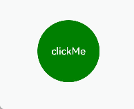
Button默认normal态显示绿色,第一次按下Tab键让Button获焦显示为focus态的红色,点击事件触发后,再次按下Tab键让Button获焦,focus态变为粉色。
图3 点击改变获焦态样式
以上内容是否对您有帮助:


更多建议: