

matplotlib 库除了可以绘制曲线图, 还可以绘制统计图形,这篇文章介绍饼图、柱状图等几种常用统计图形的绘制方法。 推荐好课:Python 自动化办公、用Python自动办公做职场高手。
1、饼图
使用 pie() 方法绘制饼图:
import matplotlib.pyplot as plt
print('\n-----欢迎来到w3cschool.cn')
plt.rc('font',family='Arial',size='9')
plt.rc('axes',unicode_minus='False')
labels = ['Strawberry', 'Apple', 'Banana', 'Pear', 'Orange']
sizes = [39, 20, 55, 30,25] # 每个元素的值,会自动根据该值计算百分比
explode = [0.1, 0.2, 0, 0, 0] # 每个元素的膨胀距离,这里指定了第0和第1个
fig, ax = plt.subplots()
ax.pie(sizes, explode=explode, labels=labels, autopct='%1.1f%%', shadow=True, startangle=0)
# autopct 精度 startangle 第1个元素的起始角位置,其他元素逆时针方向组织,shadow 是否使用阴影
ax.axis('scaled') #设置饼图的样式,设置为equals显示的会是圆形
fig.savefig('matplot-basic-pie.jpg')
plt.show()
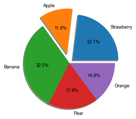
效果如图所示:
ax.pie() 方法参数:
- sizes:各元素的绝对数值大小,相对百分比会根据这些值计算;
- explode:各个部分向外弹出的值;
- autopct:百分比的显示精度;
- shadow:是否显示阴影;
- startangle:起始元素的位置,就是表示labels[0]的起始角位置,剩下的元素会逆时针方向组织。
2、柱状图
使用bar()方法绘制柱状图:
import matplotlib.pyplot as plt
import numpy as np
print('\n-----欢迎来到w3cschool.cn')
plt.rc('font',family='Arial',size='9')
plt.rc('axes',unicode_minus='False')
fig, ax = plt.subplots()
fruit = ('Banana', 'Strawberry', 'Watermelon', 'Apple', 'Papaya', 'Tomatoes')
weight = (100,135,50,83,92,66)
ax.bar(fruit, weight, align='center',width=0.7)
ax.set_ylabel('Weight')#设置x轴标签
ax.set_title('Histogram')
fig.savefig('matplot-bar.jpg')
plt.show()
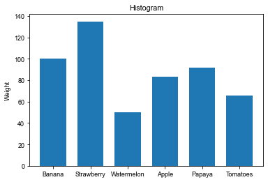
效果如图所示:
bar()参数:
- 第1个固定参数:x坐标点名称
- 第2个固定参数:y坐标值
- align:对齐方式;
- width:柱宽度;
3、水平柱状图
使用barh()方法绘制水平柱状图:
import matplotlib.pyplot as plt
import numpy as np
print('\n-----欢迎来到w3cschool.cn')
plt.rc('font',family='Arial',size='9')
plt.rc('axes',unicode_minus='False')
fig, ax = plt.subplots()
fruit = ('Banana', 'Strawberry', 'Watermelon', 'Apple', 'Papaya', 'Tomatoes')
y_pos = np.arange(len(fruit))
weight = (100,135,50,83,92,66)
ax.barh(y_pos, weight, align='center',height=0.7)
ax.set_yticks(y_pos)#设置y轴坐标
ax.set_yticklabels(fruit)#设置y轴标签
ax.invert_yaxis() # 设置标签从上到下,更符合阅读习惯
ax.set_xlabel('weight')#设置x轴标签
ax.set_title('Horizontal bar chart')
fig.savefig('matplot-hor-bar.jpg')
plt.show()
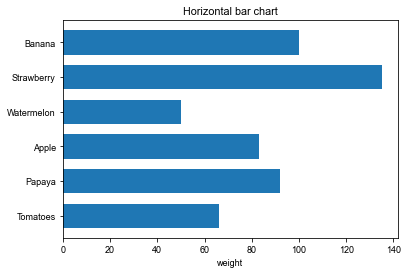
效果如图所示:
barh() 方法参数:
- 第1个固定参数:y轴坐标;
- 第2个固定参数:宽度值,实际上对应的是x轴的长度;
- align:对齐方法,可选center和edge,表示柱图的位置和对应y轴坐标的关系;
- height:柱图y方向的高度
ax.invert_yaxis()表示将y坐标反转,这样更符合阅读习惯,第0个元素在最上方显示。
4、分组柱状图
分组柱状图就是柱状图的组合形式,实际是2个柱状图合并在一起显示:
import matplotlib.pyplot as plt
import numpy as np
print('\n-----欢迎来到w3cschool.cn')
plt.rc('font',family='Arial',size='9')
plt.rc('axes',unicode_minus='False')
fruit = ('Banana', 'Strawberry', 'Watermelon', 'Apple', 'Papaya', 'Tomatoes')
weight = (100,135,50,83,92,66)
count = (20,15,30,53,22,36)
x = np.arange(len(fruit))
fig, ax = plt.subplots()
width = 0.4
ax.bar(x-width/2, weight, width=width,label='weight')
ax.bar(x+width/2, count, width=width,label='number')
ax.set_title('Grouping histogram')
ax.set_ylabel('Weight / number')#设置y轴标签
ax.set_xticks(x) #设置x轴坐标值
ax.set_xticklabels(fruit) #设置x轴坐标标签
fig.savefig('matplot-bar-group.jpg')
ax.legend() #显示图例
plt.show()
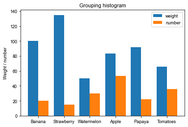
效果如图所示:
bar()入参的第1个参数不是直接使用分类形式的tuple,而是根据分类的数量重新定义的numpy数组,这样2个柱形图就可以根据该数值加减宽度的一半实现并排放置。
用法类似pyplot.plot(),多了个参数where表示划线阶梯在该点的前中后哪个位置,可以是’pre’,’mid’,’post’等三种类型,默认’pre’。